Destination Irvine
Irvine's brand was getting lost in a sea of sameness. They turned to our team at Noble Studios to differentiate their brand from other SoCal destinations.
Agency: Noble Studios
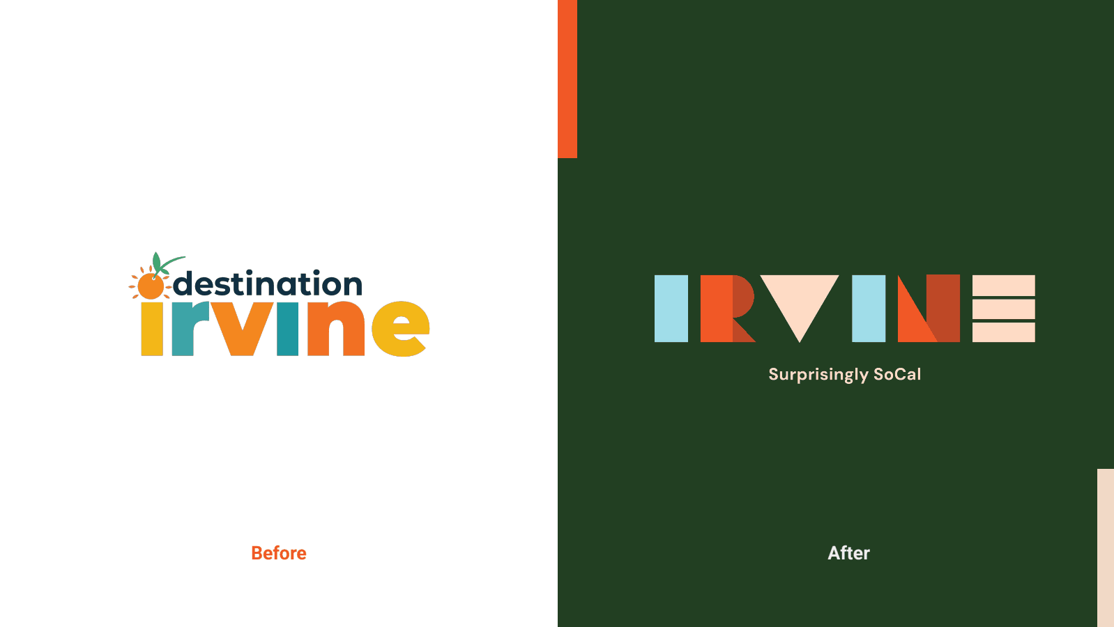
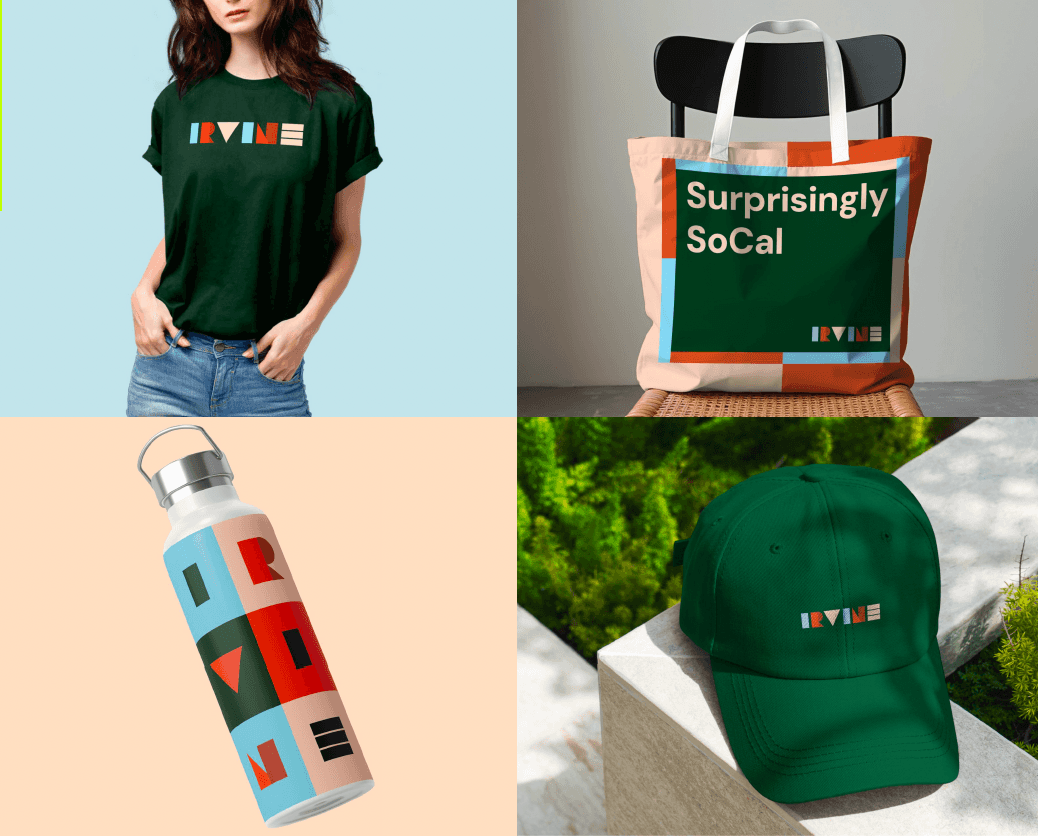
The logo redesign drew inspiration from a bird’s-eye view of the city, turning urban patterns into abstract shapes that formed a custom wordmark. The new, geometric logo uses a bright, bold color palette that feels modern and unlike other SoCal destinations.
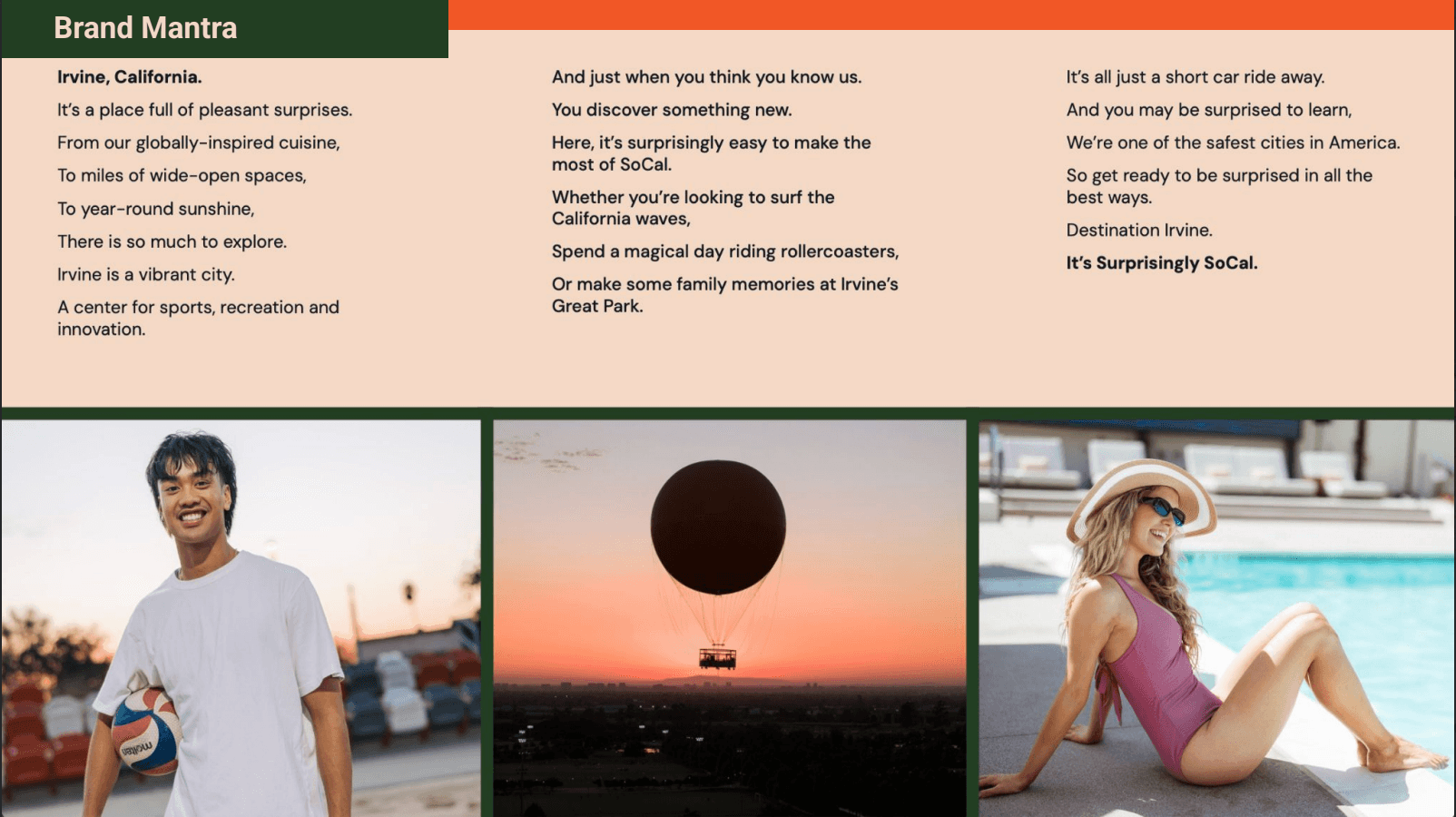
Brand Book
In addition to a new logo, our team developed a new brand line and comprehensive brand guidelines. I wrote the copy for the destination’s brand book, which included guidelines for brand voice and tone, photography, logo usage and marketing samples.
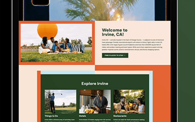
The Irvine website got a new look to match the rebrand.
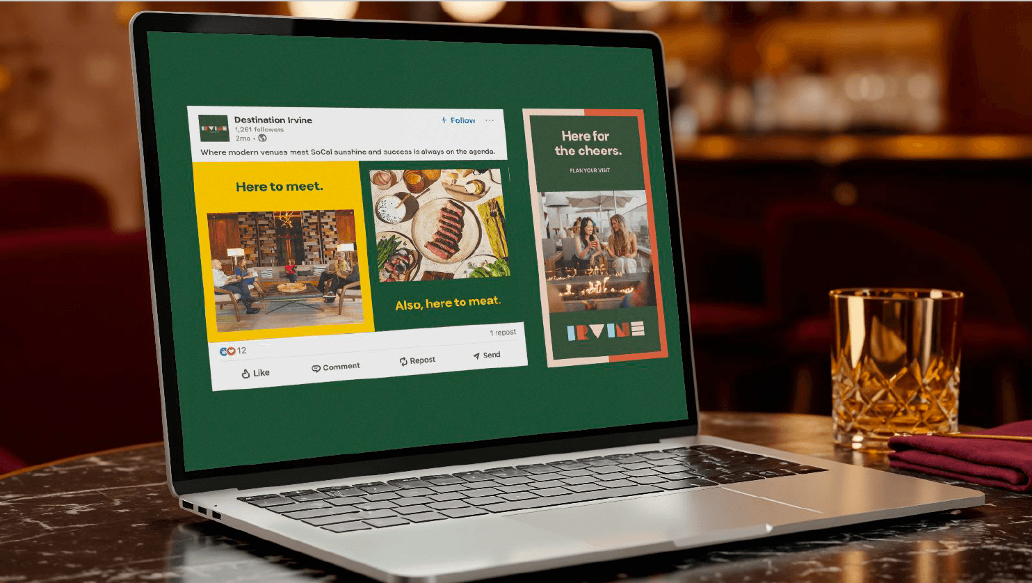
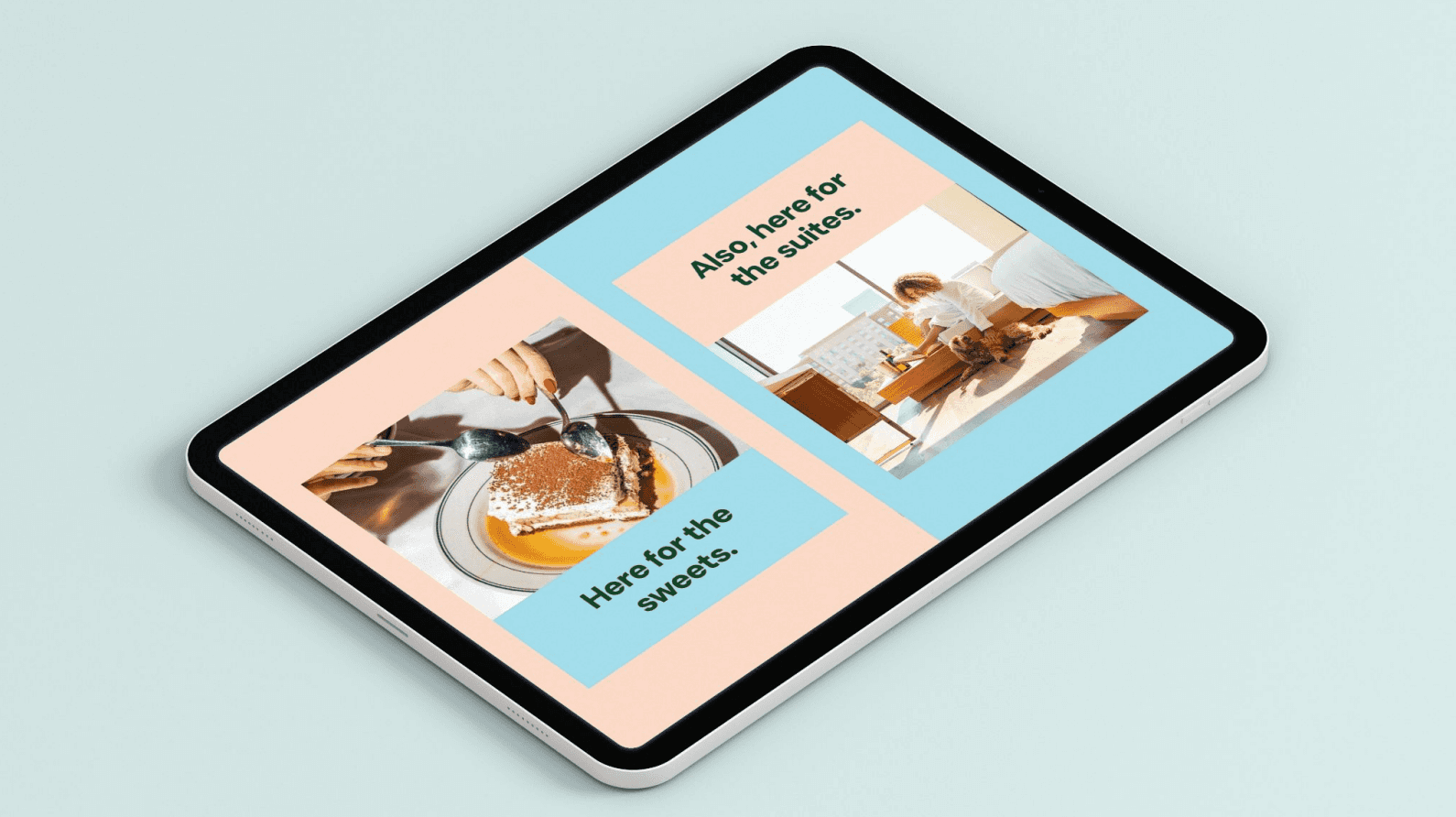
The Flipside
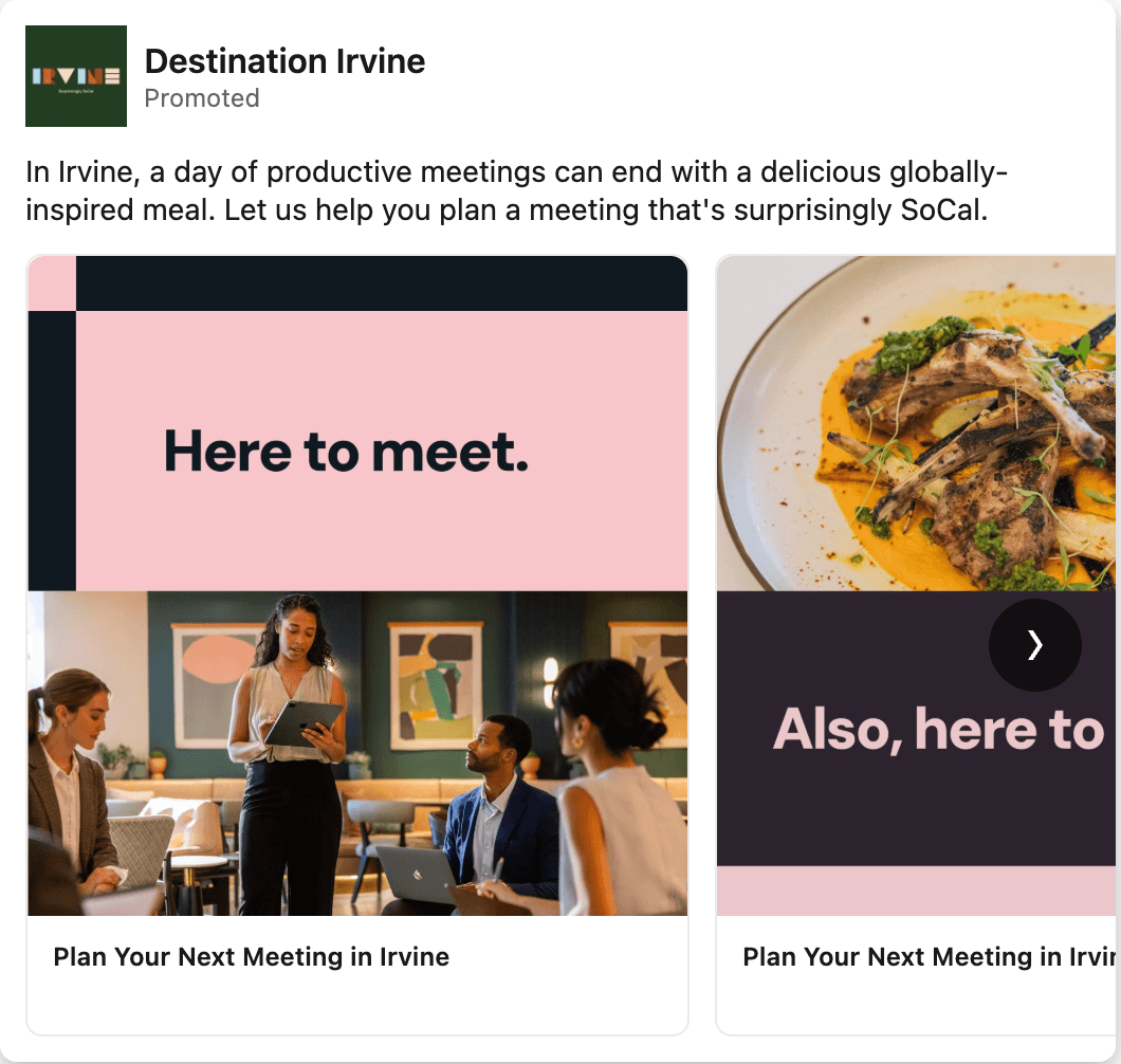
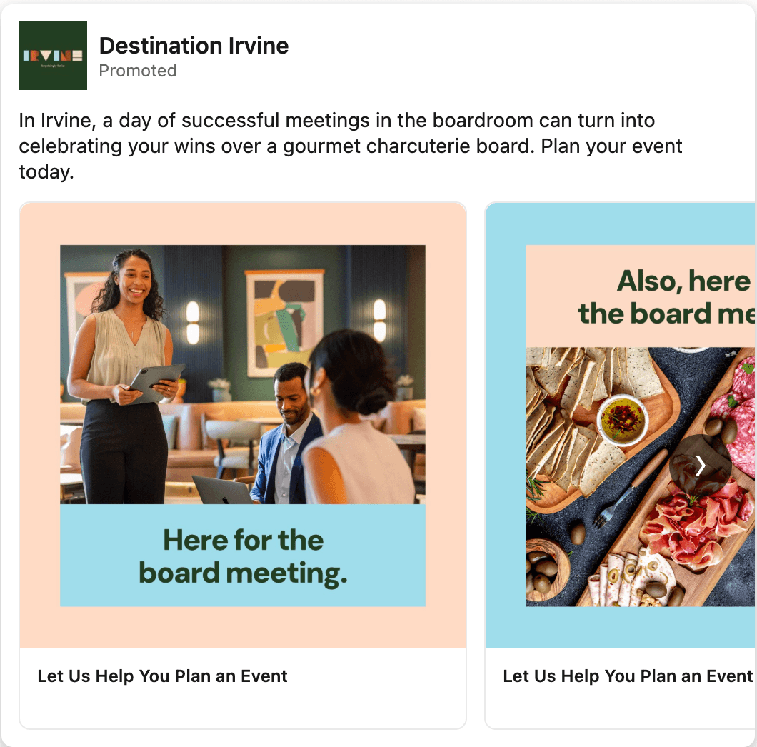
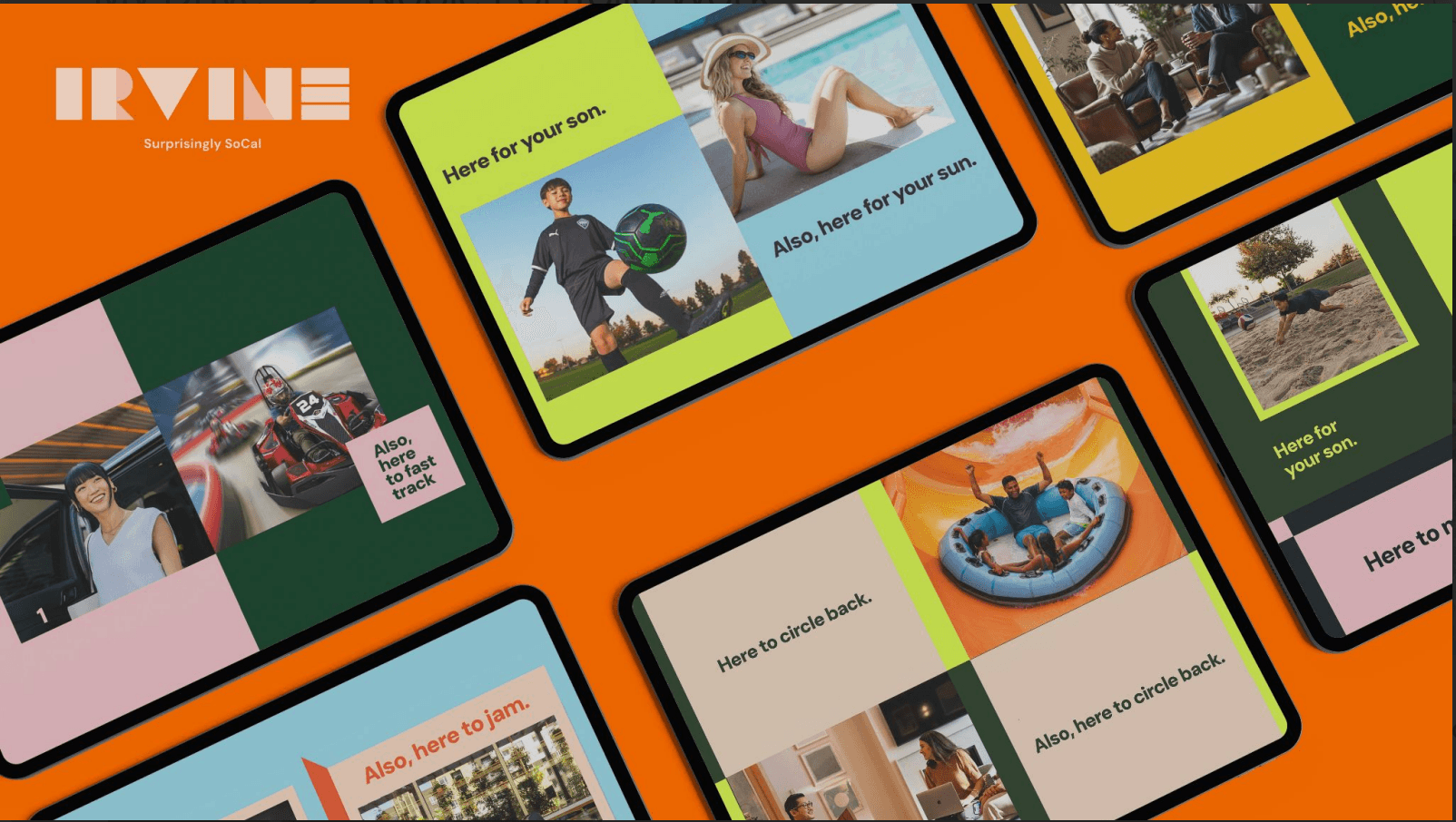
The new brand was brought to life with our Flipside campaign. The idea is that while people may come to Irvine for work or a sports event, that's just the beginning of what there is to experience. Each execution paired a visitor’s reason for coming with a reason to stay. For example, you can come to Irvine for your son's soccer tournament but stay for the California sun.
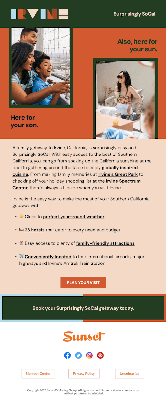
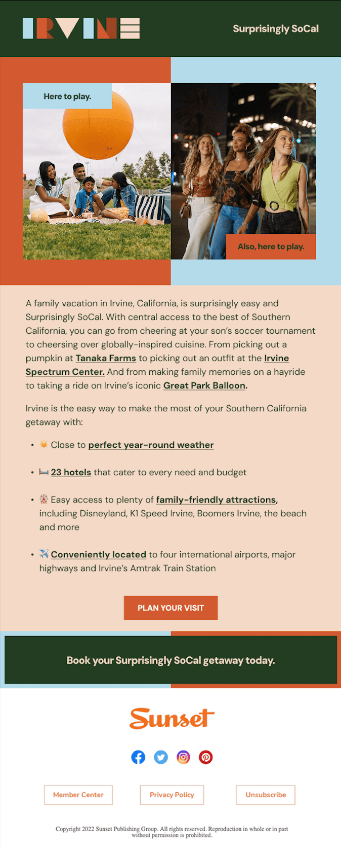
Eblasts
I wrote copy for Irvine's email campaigns, which targeted families to choose Irvine for a "Surprisingly SoCal" getaway.
Paid Ads
This simple structure of The Flipside campaign could be easily used across multiple audiences, as demonstrated by the paid ads I wrote below.